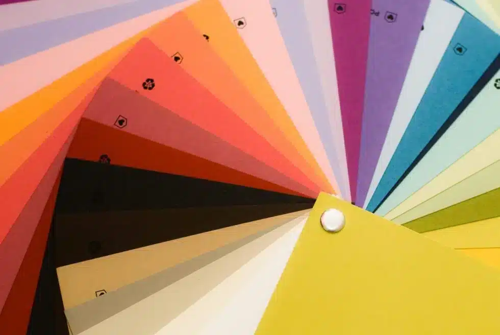
The eighth step in Active Marketing’s branding process is creating the color palette. Your website’s color could possibly be the first thing the reader notices and can be a determining factor as to whether they will stay and play or bounce to another, more attractive site. Each color provokes a specific emotion or thought process in us as human beings, so it is essential that we find the perfect color that encapsulates your brand and the feelings you’d like it to incite.
Using Color in Marketing
Color can have a huge impact on the audience, whether it is on a web page, a print ad, a television commercial or anything in between, the colors you choose literally paint the image of your brand and communicate emotions that you want your audience to feel. Think about a color. Do any brands come to your mind? Let’s look at a couple examples:


Do any of those bring to mind a specific brand? Chances are at least a couple of them sparked some ideas. Why is that? How is that?
Because each color provokes a different emotion, and because the same color palettes are used across all marketing materials for these companies, we as consumers are able to connect to each color on a deep level and relate it to the feeling, emotion or thought we have while using that specific product.
Red and white, for example. What do you think of? The pop of a can top? The fizz of carbonation? The feeling of tiny bubbles on your nose? The taste of rich, sweet cola? All of that comes from two simple colors. Imagine having a consumer be able to see your colors out in the world and not only relate them back to you, but crave or desire your product. That is a powerful association to strive towards.
The Color of Emotion
Every color in the rainbow provokes a different emotion and can even convince people to perform certain actions. Something as simple as having the right color in the right place can greatly
increase your company’s conversion rates. In order to pick out the perfect colors for you, we take all of the data we’ve collected so far in the branding process and sift through the rainbow to pull out a group of colors that will reinforce the personality of the brand.

Some emotion-provoking colors are:
- Red – Energy, danger, strength, power, action, passion, desire, love
- Orange – Enthusiasm, fascination, happiness, creativity, determination, attraction, success
- Yellow – Joy, happiness, intellect, energy, hunger
- Green – Growth, harmony, freshness, fertility
- Blue – Depth, stability, trust, loyalty, wisdom, confidence, intelligence, truth
- Purple – Power, nobility, luxury, ambition
- White – Safety, purity, cleanliness, faith, goodness, innocence
- Black – Power, elegance, formality, death, evil, mastery
The Color of Competition
Because color provokes such strong associations, it is important that your palette is different than any of your competitors’ in order to create a brand that stands out and doesn’t just get tossed aside because its colors already have a place in the market.
In order to avoid this, we invest time in creating a list of all of your competitors and their color schemes. We then sort that list by the frequency of the color in each palette and use that information to avoid the most used colors and color schemes while developing your brand.
Creating the Palette
After we’ve determined what colors NOT to use based on the competition, we pick out several colors that reinforce your brand personality that are used by competitors as infrequently as possible. This will help to create a brand that is different in appearance from substitute offerings by your competition.
For each color we pick out, we will provide specific use-cases with examples in order to know when and where each color will be used. We keep the number of colors to a minimum, though, because fewer color variations will make the colors you do have in your palette have a greater impact.
Adding color to your campaign may be fun, but it is an extremely important step that should be taken seriously in order to create a successful, lead-generating brand.


